.svg)
.svg)

.svg)
.svg)


%20(1).jpg)
Our Apps Have Driven
5X AOV | 2X Conversions | $30M+ Additional Revenue
5X AOV | 2X Conversions | $30M+ Additional Revenue
.svg)


5.0 (3000+ Reviews)


Shopify Apps





.svg)

Conversion Rate Optimization has become one of the highest-leverage growth levers for ecommerce brands in 2025. With acquisition costs rising and competition increasing across every channel, brands can no longer rely solely on traffic growth. They must improve the percentage of visitors who convert. CRO focuses on understanding user behavior, fixing friction points, and optimizing every stage of the store experience—from the homepage to checkout.
For Shopify merchants, CRO offers a direct path to higher revenue per visitor, improved customer experience, and sustainable growth without increasing ad spend. Even small changes like faster load times, better product information, or simplified checkout can result in measurable gains. Modern onsite tools and Shopify apps also make CRO execution easier, enabling brands to test ideas quickly and personalize experiences at scale.
This guide provides a complete 32-point CRO checklist, covering foundational research, UX improvements, on-page optimizations, product page enhancements, checkout improvements, user psychology, and analytics. Each point includes practical steps, actionable insights, and when relevant, how apps like Kite, Easy Bundles, Fly Bundles, and Checkout Wiz fit into a Shopify CRO stack.
Use this checklist as a structured playbook to improve your conversion rates consistently and create a frictionless buying journey for your customers.
Clear conversion goals ensure your CRO efforts are focused and measurable. Instead of optimizing everything at once, identify the actions that matter most—purchases, add-to-cart events, or lead captures—and align your site experience around them.
• Select one primary goal (e.g., completed purchase)
• Define secondary actions that support the primary goal (e.g., add to cart)
• Map supporting micro-actions like clicks or scroll depth to understand intent
A clear funnel reveals where users leave the buying journey. Understanding funnel behavior helps you prioritize fixes that unlock the highest revenue impact.
• Outline the core steps from landing to checkout
• Use analytics to track drop-offs at each stage
• Identify high-exit touchpoints and optimize them first
Understanding real user behavior allows you to pinpoint friction, confusion, motivations, and patterns that analytics alone cannot reveal. This is foundational for data-backed CRO decisions.
• Review heatmaps and scroll maps to analyze attention
• Use on-site surveys for direct feedback
• Track session recordings to observe navigation issues
Drop-off pages highlight where users hesitate or lose interest. Fixing these pages can lead to immediate conversion improvements because they stop revenue leakage at critical points.
• Check exit rates and bounce rates on core pages
• Compare ATC rate vs. product views
• Monitor funnel visualization reports weekly
Accurate tracking is essential for any CRO process. Without reliable data, it becomes impossible to identify issues, measure improvements, or understand user behavior across different funnel stages.
• Enable enhanced ecommerce tracking to capture key actions
• Configure events for add-to-cart, checkout steps, video plays, and CTA clicks
• Use UTM tagging consistently across ads and campaigns
Page speed is one of the most impactful CRO levers. Even a one-second delay can reduce conversions significantly. Faster sites improve user satisfaction, lower bounce rates, and boost conversions.
• Compress and lazy-load high-resolution images
• Remove unused scripts and reduce app bloat
• Use lightweight themes and optimized hosting
Most ecommerce traffic now comes from mobile, which means mobile usability directly impacts revenue. A mobile-first design ensures that navigation, CTAs, and product information remain easy to access.
• Use large, easy-to-tap CTAs and buttons
• Make all key content visible above the fold
• Ensure checkout forms are mobile-friendly
Friction occurs when users encounter barriers that slow or confuse the buying journey. Minimizing friction dramatically improves engagement and conversion rates.
• Eliminate broken links, 404s, and looping redirects
• Simplify layouts by removing unnecessary design elements
• Ensure interactive elements work smoothly on all devices
Clear navigation helps users find products faster, reducing confusion and drop-offs. A simplified menu structure improves product discovery, supports SEO, and increases the likelihood of adding items to cart.
• Keep the main menu concise with product-first categories
• Limit deep nesting to avoid overwhelming users
• Add featured collections for faster browsing
Users who search convert at a much higher rate than those who don’t. An optimized onsite search experience reduces frustration and helps shoppers reach relevant products instantly.
• Add predictive suggestions as users type
• Ensure search recognizes synonyms and misspellings
• Display popular and high-intent filters in results
Your hero section is often the first impression users get. A clear value proposition, strong visuals, and direct CTAs can significantly improve engagement and reduce bounce rates.
• Use a concise headline that communicates clear value
• Choose a lifestyle or real-context image for stronger emotional impact
• Add a primary CTA that leads to a high-intent collection or product
Displaying curated collections on the homepage guides shoppers toward high-performing product categories. This simplifies decision-making and improves the odds of first-click engagement.
• Showcase bestsellers, trending items, or seasonal picks
• Use clean product grids that load quickly
• Include badges like “New,” “Top Rated,” or “Bestseller”
Trust is one of the strongest conversion drivers. When visitors see proof that your brand is reliable, they feel more confident about purchasing. Adding visible trust elements on the homepage and key pages helps reduce hesitation.
• Display authentic customer reviews and ratings
• Showcase press mentions, certifications, or brand logos
• Add trust badges near CTAs and checkout-relevant areas
Your calls-to-action must be direct, visible, and benefit-driven. Clear CTAs help users understand what happens next, reduce confusion, and increase engagement across all stages of the funnel.
• Use concise, expectation-setting phrases like “Buy Now” or “Add to Cart”
• Repeat your primary CTA at strategic scroll points
• Ensure CTAs stand out visually from the page
Product images strongly influence buying decisions. Clear, high-resolution visuals reduce uncertainty and give shoppers the confidence they need to move forward.
• Add multiple angles and close-ups
• Include lifestyle images showing real use
• Enable zoom functionality for detail inspection
Videos bridge the gap between online and in-person shopping. They demonstrate product usage, scale, and benefits, helping shoppers understand what they’re buying.
• Include a short demo video showing the product in action
• Add comparison or feature-explainer clips for complex items
• Keep videos lightweight for fast loading
Clear, benefit-focused product descriptions help users understand why a product is worth buying. Customers scan quickly, so descriptions must communicate value, solve concerns, and guide the reader toward taking action.
• Highlight primary benefits before technical specs
• Break text into short, scannable sections
• Use sensory and descriptive language that helps customers visualize use
Reviews remain one of the strongest trust signals in ecommerce. Featuring authentic customer feedback, photos, and Q&A reduces hesitation and supports faster purchase decisions.
• Place top reviews above the fold on product pages
• Add user-uploaded photos for authenticity
• Include verified badges for credibility
Comparison tables and FAQs help remove uncertainty by addressing common concerns directly on the page. This reduces analysis paralysis and keeps shoppers engaged longer.
• Compare variations like size, features, or materials
• Include answers to common delivery, fit, and product-care questions
• Use simple, skimmable table layouts
Cart abandonment is often caused by unnecessary friction—confusing layouts, hidden costs, unclear shipping, or too many steps. Streamlining the cart experience can significantly increase add-to-cart completions and reduce drop-offs.
• Display shipping details early to avoid surprises
• Make cart editing simple with clear quantity and variant selectors
• Ensure the cart loads quickly and remains consistent across devices
Smart upsells increase average order value without harming conversion rates. When presented at the right moment, complementary products improve cart value and enhance the shopper’s experience.
• Offer relevant add-ons, not random recommendations
• Show upsells after add-to-cart, in the cart, or pre-checkout
• Keep upsell copy simple and action-focused
Skailama Mention (Fly Bundles)
Fly Bundles helps Shopify stores add in-cart and pre-checkout upsells that boost AOV without creating friction.
Bundles increase both conversion rate and AOV by simplifying decision-making. Customers feel they’re getting more value, while stores benefit from bigger basket sizes.
• Combine complementary products into curated bundles
• Create savings-based bundles to reduce hesitation
• Highlight bundle value visually and numerically
Skailama Mention (Easy Bundles)
Easy Bundles helps brands create customizable and mix-and-match bundle offers that convert well across product categories.
Mandatory account creation increases checkout abandonment. A guest checkout option lowers friction, speeds up the process, and supports faster decision-making.
• Let shoppers check out without creating an account
• Offer post-purchase account creation as an optional step
• Reduce required form fields to essentials only
Checkout clarity is essential for lifting conversion rates at the final step. Clean design, transparent information, and trust-building elements reassure shoppers and reduce hesitation.
• Show order summary, shipping details, and total cost upfront
• Add trust badges and clear guarantees
• Ensure fields are mobile-friendly and easy to complete
Skailama Mention (Checkout Wiz)Checkout Wiz enables Shopify brands to customize shipping layouts, add reassurance blocks, and improve checkout clarity to increase conversions.
Personalized recommendations reduce decision-making time and help shoppers discover relevant products faster. By aligning suggestions with browsing behavior, interests, or cart history, you significantly improve conversion probability.
• Display recommendations on product, cart, and homepage sections
• Base suggestions on user intent, browsing history, or category relevance
• Keep recommendations visually consistent and easy to scan
Skailama Mention (Kite)
Kite helps Shopify stores deliver personalized, AI-driven recommendations that adapt to user behavior in real time.
When used ethically, scarcity and urgency create momentum in the buying process. They help shoppers act sooner by highlighting limited stock, time-bound offers, or fast-moving inventory.
• Use real stock levels instead of artificial limits
• Add countdown timers for genuine limited-time offers
• Highlight deadlines during sales or seasonal events
Shoppers hesitate when risk feels high. Clear guarantees and transparent return policies lower this psychological barrier, increasing purchase confidence and reducing cart abandonment.
• Offer a satisfaction guarantee or money-back promise
• Display return terms near CTAs and above-the-fold sections
• Use straightforward language without fine print
Real-time support resolves objections quickly and keeps users engaged. Whether via chatbots or live agents, support availability often determines whether a shopper completes a purchase or exits the store.
• Add live chat on product and checkout pages
• Use automated FAQs to answer common questions instantly
• Provide multiple support channels like email and WhatsApp
Unclear shipping details are one of the top causes of cart abandonment. Being transparent with delivery dates and costs early in the shopping journey guides expectations and builds trust.
• Display estimated delivery dates on product pages
• Show shipping costs or free-shipping thresholds prominently
• Add a delivery timeline on the cart page
A/B testing allows you to validate ideas with real data instead of assumptions. Even small changes—like adjusting a CTA color or headline—can reveal significant conversion lifts.
• Test one element at a time for accurate results
• Start with high-impact areas: CTAs, images, hero sections
• Use statistical significance before rolling out changes
Consistent performance monitoring helps you detect issues early and identify growth opportunities. Weekly reporting ensures that CRO remains an ongoing system instead of a seasonal activity.
• Conversion rate (overall + by device)
• Add-to-cart and cart abandonment rate
• Bounce rate on high-traffic pages
• AOV, revenue per visitor, scroll depth
CRO is never a one-time project. User behavior shifts, competition evolves, and seasonal patterns change. Continuous iteration ensures your store remains optimized across the entire year.
• Review analytics reports to spot trends
• Refresh creatives, offers, and layouts regularly
• Re-run winning tests periodically to confirm relevance
The right CRO tools help brands collect accurate data, understand user behavior, test ideas quickly, and optimize shopping experiences without guesswork. For Shopify merchants, these tools form the backbone of a reliable optimization workflow.
Tools that help you measure user behavior, track conversions, and identify drop-off points.
These tools reveal how users interact with each page.
Tools that influence user actions with targeted experiences.
These tools help validate design and content changes scientifically.
Tools designed to lift AOV and reduce checkout friction.
Tools for understanding user motivations, objections, and needs.
Improving your conversion rate is one of the most efficient and sustainable ways to grow an ecommerce business in 2025. Instead of relying solely on more traffic or increased ad spend, CRO helps you unlock more value from the visitors you already have. By addressing friction, optimizing product discovery, strengthening trust, and refining checkout experiences, brands can see measurable lifts in revenue, AOV, and customer satisfaction.
This 32-point checklist provides a structured approach to optimization—starting from foundational analytics all the way to personalization, trust-building, and continuous testing. Treat CRO as an ongoing process rather than a one-time project. The most successful Shopify stores review their metrics regularly, implement small but consistent improvements, and test changes systematically.
Using the right tools, including personalization engines, bundling apps, and checkout enhancers, helps accelerate CRO results and reduce execution time. When each touchpoint in the funnel works together seamlessly, every visitor gets a smoother, faster path to purchase—leading to higher conversions and stronger long-term growth.


.avif)

Free webinar
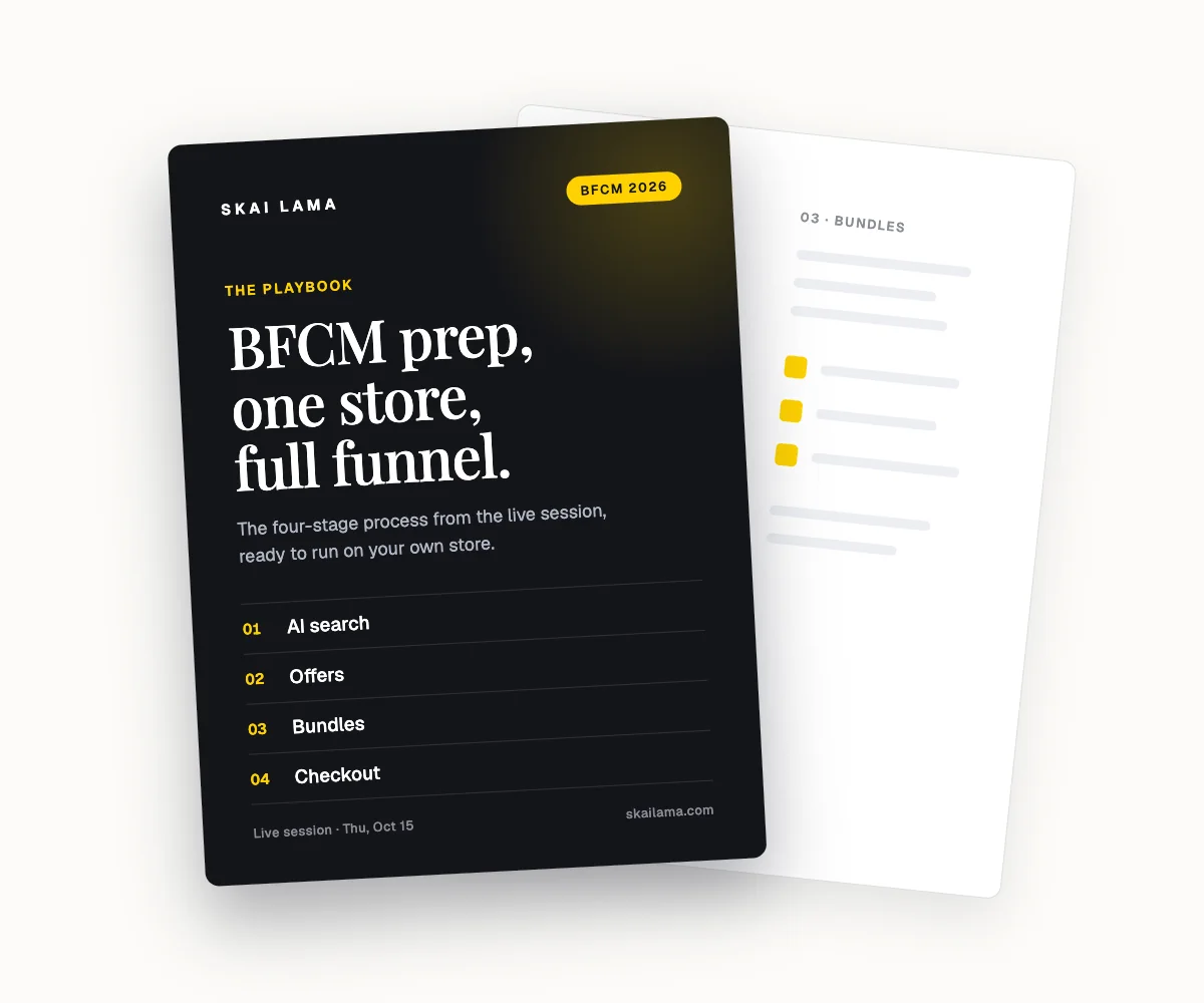
BFCM prep, live on one store.
We take one Shopify store through the whole BFCM funnel on screen, from AI search to checkout. You leave with the playbook to run the same on yours.
Thu, Oct 15
1 PM ET · 10 AM PT
60 minutes
Can't make it live? Register anyway. The recording and the playbook go to everyone who signs up.
Save your free seat
BFCM Prep Live. Thu, Oct 15 at 1 PM ET, 10 AM PT, 6 PM UK. 60 minutes.