.svg)
.svg)
.svg)
.svg)


.svg)
.png)
.png)
Our Apps Have Driven
5X AOV | 2X Conversions | $30M+ Additional Revenue
5X AOV | 2X Conversions | $30M+ Additional Revenue
.svg)

5.0 (900+ Reviews)


Shopify Apps


.svg)

Your checkout page is the highest-leverage page in your store. Every other page, from your homepage to your product and collection pages, exists to get a customer here. And yet most Shopify merchants spend 90% of their optimization effort everywhere except checkout.
Cart abandonment is the clearest evidence of this. Baymard reports an average abandonment rate of 70.19%, meaning roughly 7 out of 10 shoppers who reach checkout never complete their purchase. The good news is that much of this is preventable, and the brands below show exactly how.
The six Shopify checkout page examples in this article do not succeed because they look visually impressive. Each one removes a specific source of friction, builds trust at the right moment, or makes it easier for a customer to finish what they started. They were chosen because together they cover the major checkout-optimization levers available on Shopify Plus, and each includes a tactic you can adapt for your own store.
Before we look at the examples, a quick framing. The checkouts that convert best are not the ones with the most features. They are the ones who do three things consistently:
Keep those three lenses in mind as you go through the examples below. Each one earns its place in this list by doing at least one of them well.
The six checkout examples below are drawn from real Shopify stores and were chosen because each demonstrates a distinct conversion tactic. Unlike many Shopify checkout examples that simply showcase screenshots, these explain the logic behind each customization and how merchants can apply similar ideas to their own stores.
Together, they cover the major checkout optimization levers available on Shopify Plus.
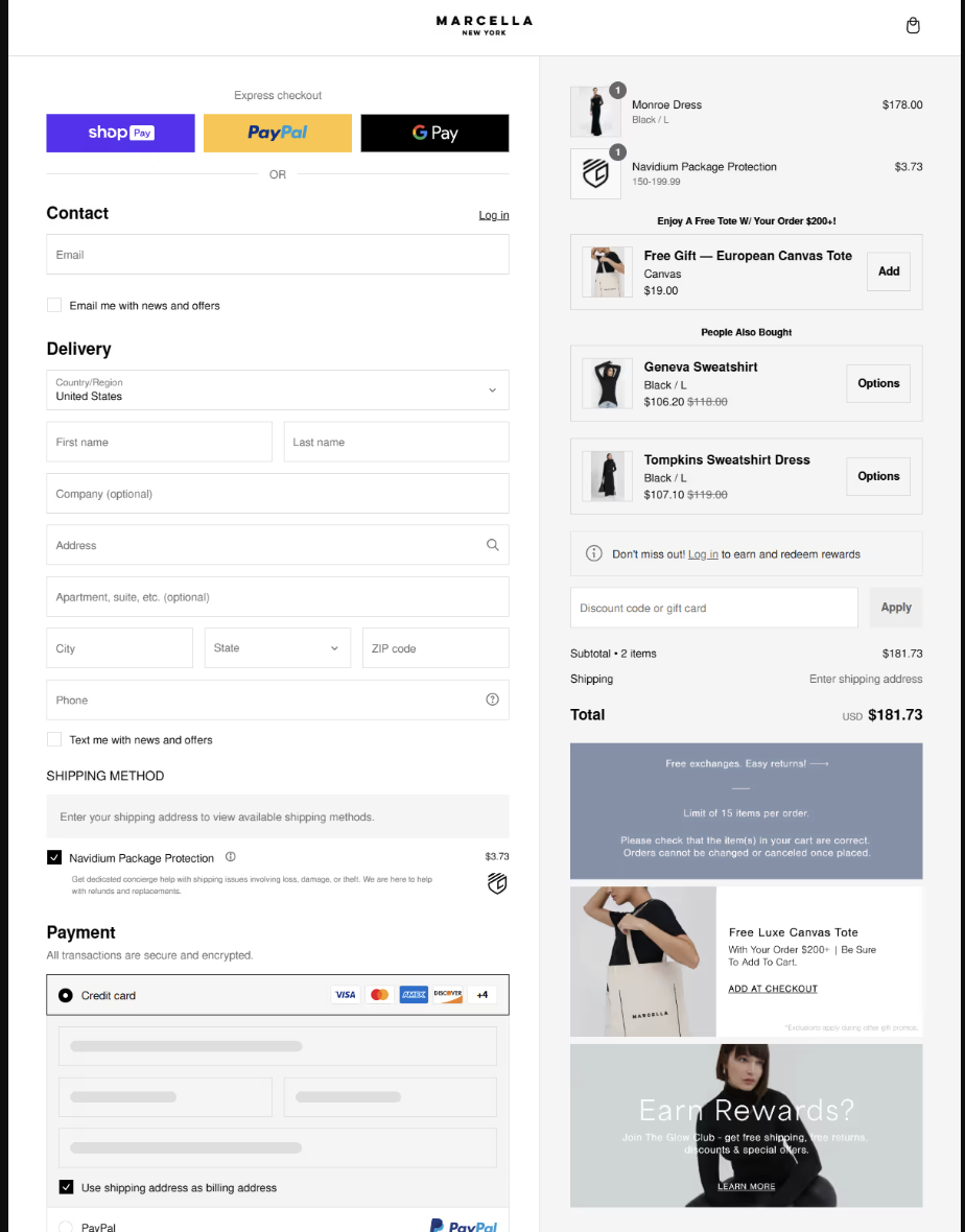
Industry: Women's Fashion.
Marcella NYC is one of the fastest-growing DTC fashion brands in the US, having appeared on the Inc. 5000 list of America's fastest-growing private companies for four consecutive years. NYC-designed and European-handcrafted, the brand sells through its own site as well as Nordstrom, Bloomingdale's, and Macy's. Roughly 44% of its shoppers are repeat buyers, which tells you the checkout experience is doing more than completing a transaction; it is building a relationship.
In this checkout page example, a product upsell surfaces a complementary item relevant to the cart. A non-product upsell offers a high-margin add-on (such as shipping protection). A free gift incentive rewards customers who cross a spend threshold. A message banner communicates something operationally useful, say, shipping window, return policy, carbon-neutral delivery, without interrupting the checkout flow.
The result is a checkout that increases AOV on multiple axes simultaneously while keeping the experience clean and purposeful.
Do not pick one checkout optimization and stop there. Stacking a product upsell, a non-product add-on, and a message banner together addresses AOV, margin, and friction reduction simultaneously. The key is that each element must earn its place; if it does not directly help the customer complete or enhance the purchase, it should not be there.
Checkout Optimization Techniques used: Product Upsell, Non-Product Upsell, Free Gift, Message Banner
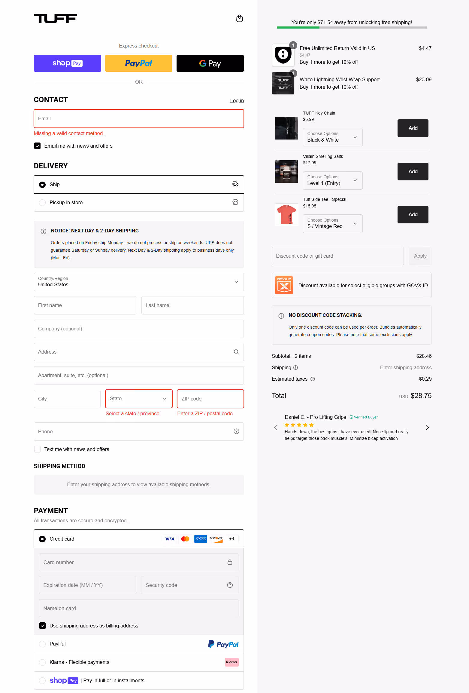
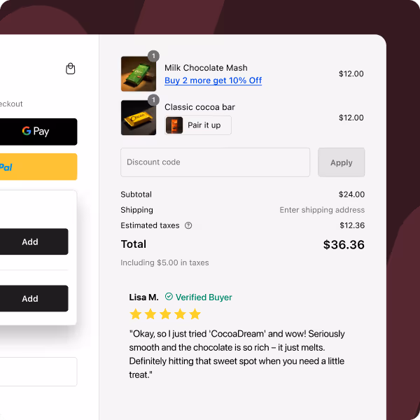
Industry: Fitness and Activewear
TuffWraps is a lifting gear and activewear brand built by lifters, for lifters. Their product line spans wrist wraps, knee sleeves, belts, and apparel, all designed for serious strength training rather than gym fashion. The brand has a loyal community of repeat customers who return specifically because the products hold up under heavy use.
This checkout page example reflects the brand's no-nonsense positioning. Rather than leading with promotions or free gift offers, it leads with trust: customer reviews and ratings appear directly in the checkout flow, addressing the exact moment when a new customer might hesitate. A free shipping progress bar does double duty: it reduces the sting of shipping cost by reframing it as a threshold to unlock, and it lifts AOV by encouraging customers to add one more item to qualify.
A product upsell and a message banner complete the picture, but the defining feature of this checkout is the balance it strikes between conversion optimization and social proof. It converts without feeling like it is trying too hard.
If your brand has strong reviews, carry them all the way to checkout. Most brands only show social proof on product pages, where purchase intent is still forming. Showing reviews at the payment step, when the customer is already committed but might still back out, is one of the least used and most effective trust levers available.
Checkout Optimization Techniques used: Product Upsell, Reviews and Ratings, Free Shipping Progress Bar, Message Banner
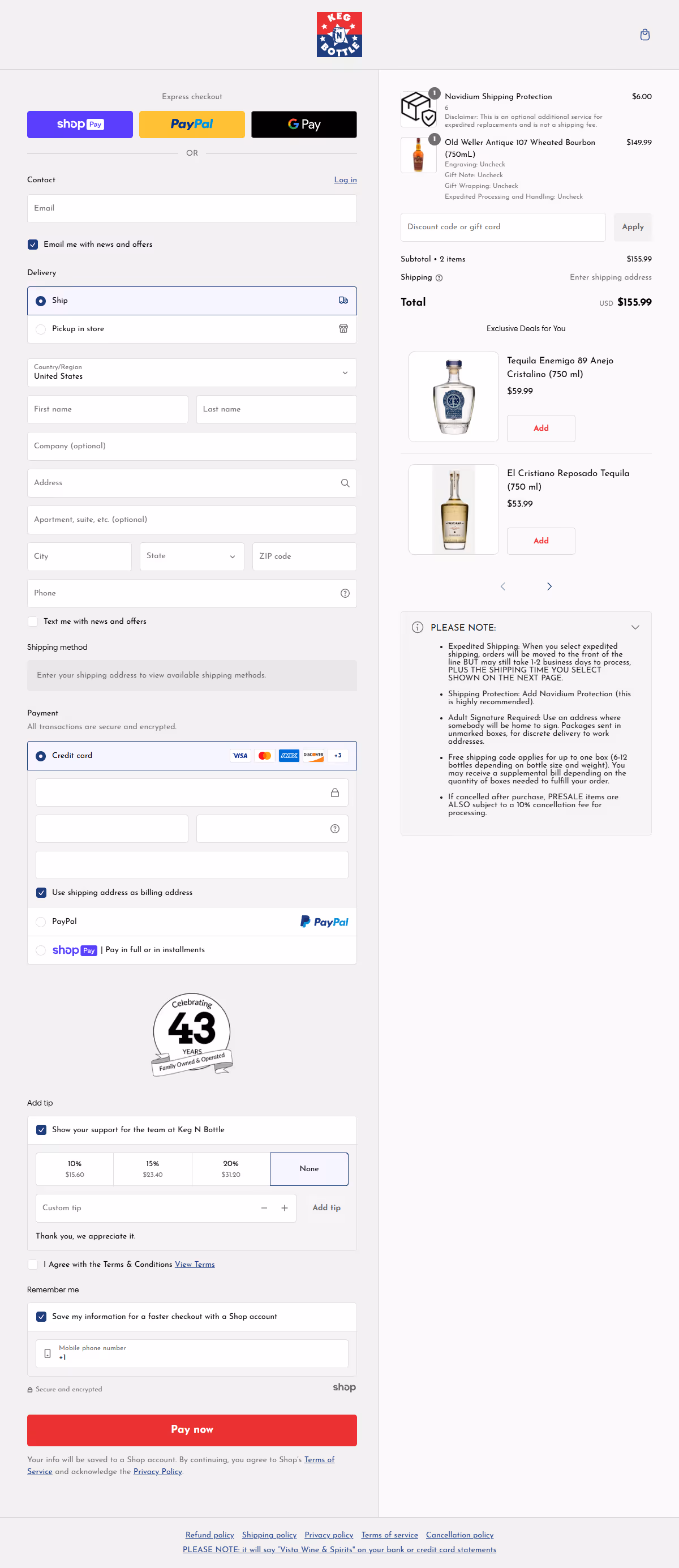
Industry: Beverages and Specialty Retail
Keg N Bottle is a specialty beverage retailer with one of the more sophisticated checkout configurations in the Lookbook. This is what a mature DTC brand's checkout looks like when every available lever has been activated thoughtfully: upsells, reassurance signals, contextual messaging, and additional functional extensions all working in concert.
The checkout page example does not feel cluttered because the hierarchy is clear. Trust signals (secure checkout badge, payment icons, guarantee messaging) sit close to the payment field where they matter most. The product upsell is relevant to the cart contents. The non-product upsell adds a high-margin service layer. The message banner answers common pre-purchase questions before they are asked: shipping window, returns, and age verification, wherever applicable.
For merchants who want to see what "the full stack" looks like, this is the example to study.
Think of your checkout as having four jobs simultaneously: complete the current transaction, increase the value of that transaction, build trust at the moment of payment, and answer any objection that might cause abandonment. Keg N Bottle's checkout architecture addresses all four. Map your own checkout against these four jobs and identify which ones you are currently not covering.
Checkout Optimization Techniques used: Product Upsell, Non-Product Upsell, Trust Signals, Message Banner, Other Extensions
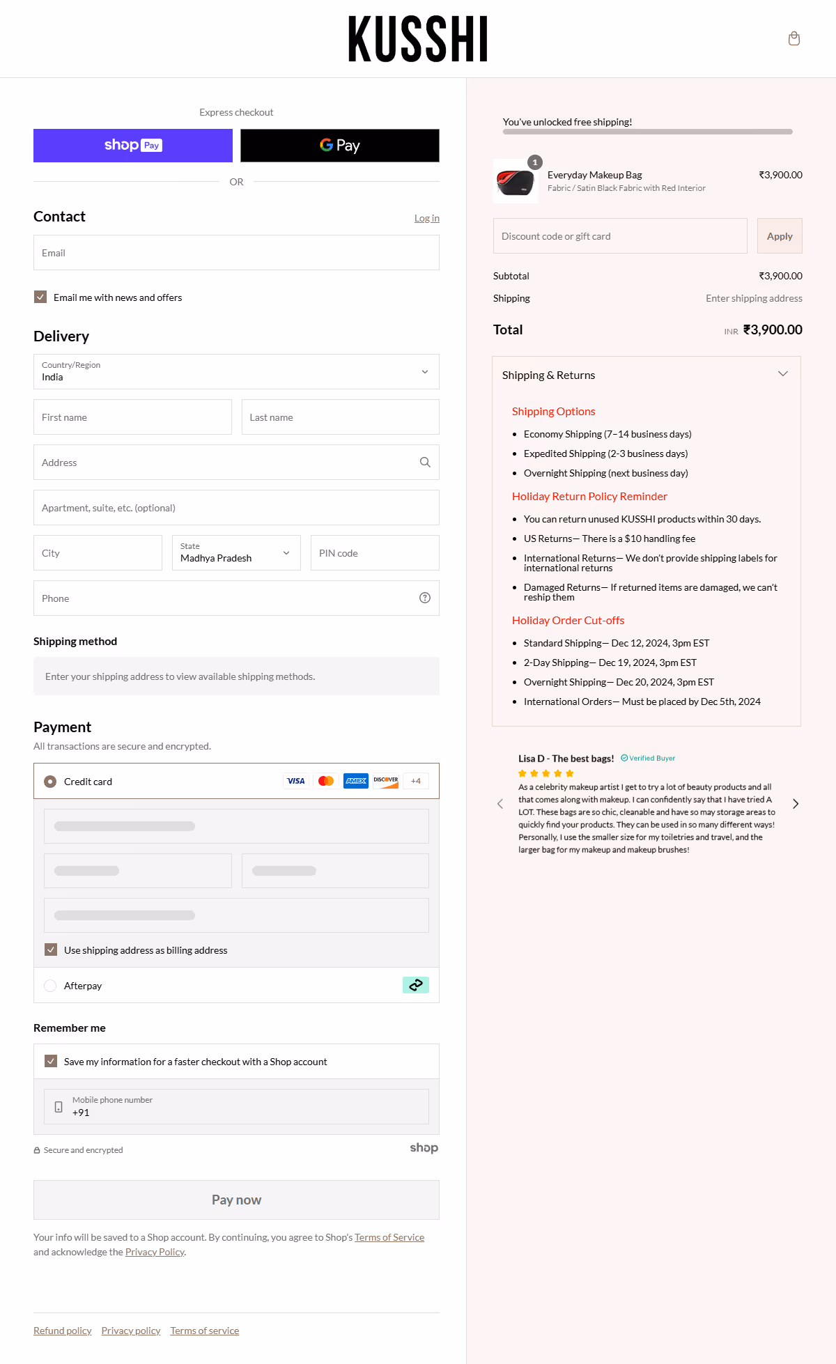
Industry: Bags and Accessories
Kusshi makes high-quality organizer bags and travel accessories with a strong reputation for thoughtful design and durability. Their checkout is the cleanest in the Lookbook and the most instructive example of what conversion optimization looks like when it is not about adding more things.
In this checkout page example, there are no product upsells. No free gift offers. No non-product add-ons. Just three well-placed elements: customer reviews to validate the purchase decision, a free shipping progress bar to reduce shipping friction, and a message banner that communicates something genuinely useful. The result is a checkout that loads fast, reads clearly, and removes the friction points that cause abandonment without introducing new complexity.
For brands where the product itself is the differentiation and the customer's main hesitation is whether to trust the brand, not whether to buy something additional, this is the right checkout model.
Audit your checkout for noise. Every element that is not actively helping the customer complete the purchase is potentially a distraction. For stores with premium, considered-purchase products, a clean checkout with strong social proof and a single incentive (free shipping threshold) will often outperform a checkout crowded with upsells and offers.
Checkout Optimization Techniques used: Reviews and Ratings, Free Shipping Progress Bar, Message Banner
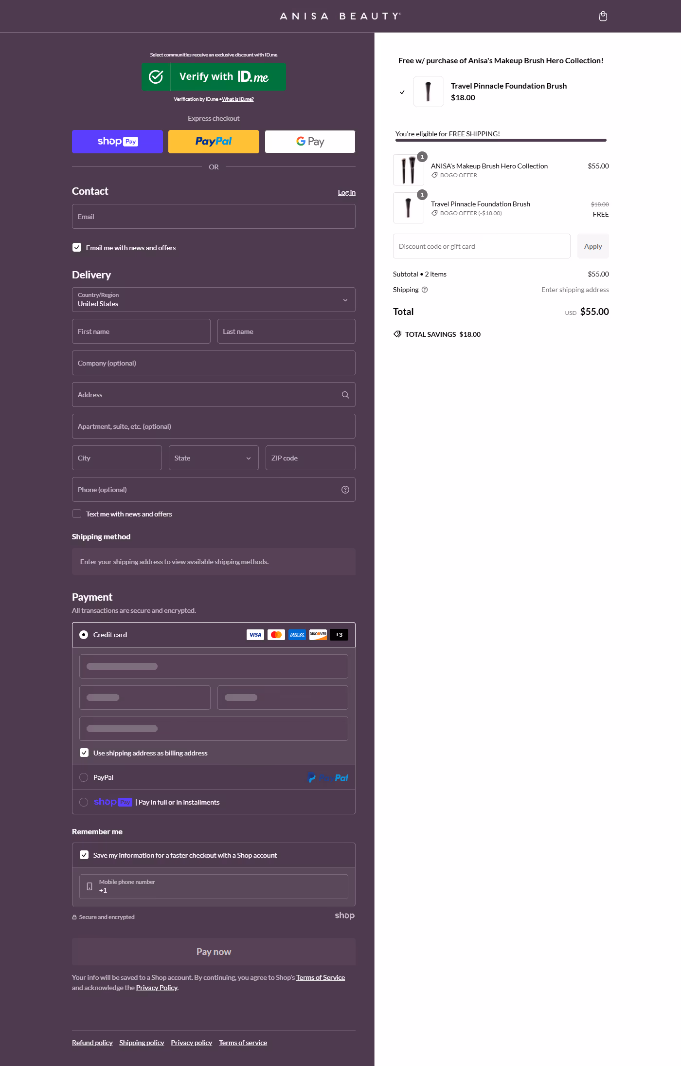
Industry: Beauty and Cosmetics
Anisa Beauty sells professional makeup brushes and tools. They are well-liked by makeup artists and fans. Their checkout page is a great example of using "threshold psychology" to boost sales. They use two simple incentives based on the customer's spending. Both are designed to encourage customers to add just one more item to their cart before finishing their order.
In this checkout page example, the free shipping progress bar and the free gift incentive work together. A customer close to the free shipping threshold sees one bar moving toward zero shipping cost. A customer who has crossed that threshold sees the next bar, say, the free gift threshold. The reward path is visible and sequential, keeping the customer engaged by maximizing value rather than minimizing spend.
This is reward psychology applied cleanly. Customers respond more to earning something than to saving something. A free gift feels like a bonus. A discount feels like a markdown. The emotional response to each is different, and Anisa Beauty's checkout is built around the stronger of the two.
If you offer a free gift above a spend threshold, make sure the customer can see exactly how close they are to earning it at checkout. A static "Spend $75 for a free gift" banner is far less effective than a live progress bar showing "You are $12 away." The dynamic version converts because it makes the reward feel achievable and immediate.
Checkout Optimization Techniques used: Free Gift, Free Shipping Progress Bar
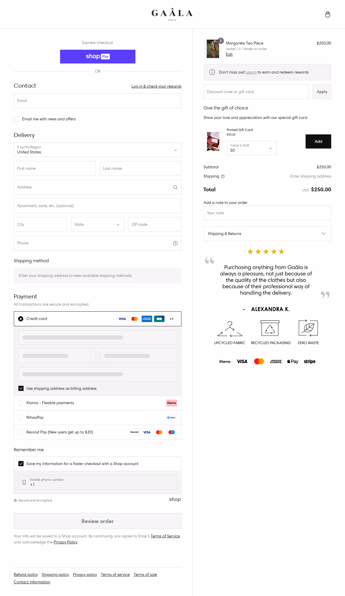
Industry: Fashion and Luxury Apparel
Gaala Paris is a fashion brand with a luxury positioning. For brands in this space: higher price points, considered purchases, customers who are buying something they will wear and be seen in, the checkout's primary job is not to add more items. It is to give the customer enough confidence to complete the transaction they have already decided to make.
Gaala Paris's checkout page example is almost entirely oriented around trust and reassurance. Customer reviews appear at the critical moment before payment. Trust signals are placed where customers look when entering card details. The non-product upsell (shipping protection or similar) adds a margin layer without undermining the premium feel.
For any brand selling at a price point where purchase hesitation is driven by "is this brand trustworthy?" rather than "do I want this product?", this is the checkout architecture to study.
Map your customers' hesitation. If the primary reason a customer abandons your checkout is price shock, your fix is transparency earlier in the flow. If it is brand trust, your fix is social proof and security signals proximate to the payment field. If it is a product doubt, your fix is reviews. Gaala Paris has correctly identified that their abandonment driver is brand trust, and their entire checkout is built around resolving it.
Checkout Optimization Techniques used: Non-Product Upsell, Reviews and Ratings, Trust Signals
These six checkout examples show there is no single formula for increasing conversions on Shopify. The best checkouts remove friction, build trust, and reinforce value in ways that align with the brand and the customer journey.
Looking across these checkout page examples, five patterns appear consistently in the stores that convert best.
This is one of the most frequently asked questions among Shopify merchants, and the answer is: yes, but with meaningful limits.
Without Shopify Plus, you can customize:
With Shopify Plus, you unlock Checkout Extensibility:
Checkout Extensibility is Shopify's framework for building apps and customizations directly into the checkout. It replaces the old checkout.liquid file approach (which Shopify deprecated for new stores) and gives merchants access to:
CheckoutWiz is a Checkout Extensibility app that makes the advanced customizations above configurable without development work. You can add trust badges, upsell widgets, custom content blocks, and branding elements directly from the app dashboard. For merchants on Shopify Plus who want to replicate the checkout experiences shown in the examples above, CheckoutWiz is the practical way to do so without an agency or developer.
Use this checkout best-practices checklist to audit your current checkout process before or after implementing changes.
CheckoutWiz by Skai Lama
CheckoutWiz is a Shopify Checkout Extensibility app for merchants on Shopify Plus and Shopify Advanced. Rated 4.9 on the Shopify App Store, it lets you customize your checkout page without writing code: add trust badges, upsell blocks, custom content, and branding elements directly from a dashboard. It is the tool that makes the advanced checkout customizations in this article practical for non-technical teams.
Key features: custom trust badges, checkout upsell widgets, post-purchase pages, custom content blocks, brand-consistent checkout design.


.avif)