.svg)
.svg)
.svg)
.svg)


.svg)
.jpg)
.png)
Our Apps Have Driven
5X AOV | 2X Conversions | $30M+ Additional Revenue
5X AOV | 2X Conversions | $30M+ Additional Revenue
.svg)

5.0 (900+ Reviews)


Shopify Apps


.svg)

Picture this: A potential customer has browsed your store, added items to their cart, and is now at your checkout page—the final step between browsing and buying. Yet, a staggering 69.23% of online shoppers abandon their carts at this crucial moment, often due to poor checkout design and user experience.
Your checkout page isn't just a payment gateway—it's the ultimate conversion battleground where visitors either transform into paying customers or exit forever. In this high-stakes digital environment, every element matters: from the loading speed and mobile responsiveness to trust signals and payment options.
The difference between a mediocre checkout and a high-converting one can mean the difference between a 2% conversion rate and a 15% conversion rate. That's potentially 7x more revenue from the same amount of traffic.
The good news? Checkout optimization typically delivers faster results than most other conversion tactics. Small tweaks to your checkout flow can produce immediate, measurable improvements in your conversion rates.
In this comprehensive analysis, we'll dissect 15 real-world checkout pages that are actually driving sales and reducing cart abandonment. These aren't just pretty designs—they're conversion-optimized experiences from brands using tools like CheckoutWiz to maximize their checkout performance.
The following checkout examples showcase real Shopify stores that have leveraged CheckoutWiz and other optimization tools to create conversion-focused checkout experiences. Each example demonstrates specific tactics and design principles that you can apply to your own store.
Industry: Fashion
Key Strength: Simplified payment process with multiple express options
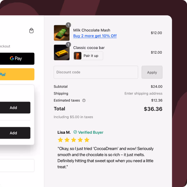
R-Malak's checkout page exemplifies the power of reducing friction at the payment stage. The fashion brand prominently displays express checkout options including PayPal, Shop Pay, and Google Pay right at the top of their checkout flow.

What Makes It Convert:
Conversion Tactic to Steal:
Place express payment options above traditional checkout forms. This allows customers who want speed to skip lengthy form filling entirely.
Industry: Equestrian Equipment
Key Strength: Intelligent cross-selling during checkout
This horse riding gear retailer has mastered the art of relevant upselling without being pushy. Their checkout page strategically recommends complementary products that genuinely enhance the customer's purchase.

What Makes It Convert:
Conversion Tactic to Steal:
Use checkout upsells to recommend products that complement the customer's intended use, not just similar items. Focus on solving additional problems your customers might have.
Industry: Women's Apparel
Key Strength: Comprehensive payment and shipping options
This women's fashion brand prioritizes customer choice and convenience, offering multiple pathways for both payment and delivery.

What Makes It Convert:
Conversion Tactic to Steal:
Don't limit your customers' choices. The more payment and shipping options you offer, the more likely you are to match customer preferences and complete the sale.
Industry: Professional Apparel
Key Strength: Account creation incentives and information saving
This professional clothing brand focuses on creating repeat customers by making future purchases incredibly easy.

What Makes It Convert:
Conversion Tactic to Steal:
Always offer customers the option to save their information, even in guest checkout. This reduces friction for future purchases while building your customer database.
Industry: Pet Accessories
Key Strength: High engagement without overwhelming the user
PupSocks proves that you can include multiple conversion elements without creating chaos, when each element serves a clear purpose.

What Makes It Convert:
Conversion Tactic to Steal:
When adding multiple elements to checkout, ensure each serves a specific conversion purpose. Remove anything that doesn't directly help customers feel confident about their purchase.
Industry: Health Supplements
Key Strength: Seamless discount application process
This health supplement brand makes it incredibly easy for customers to apply discounts, removing a common point of friction.
What Makes It Convert:
Conversion Tactic to Steal:
Make discount code entry obvious and effortless. Customers who have discount codes want to use them, and any friction here can lead to abandonment.
Industry: Activewear
Key Strength: Clear progress indication and journey gamification
This athletic wear brand uses visual progress indicators to keep customers engaged and motivated to complete their purchase.
What Makes It Convert:
Conversion Tactic to Steal: Use progress indicators to reduce checkout anxiety. When customers can see they're almost done, they're less likely to abandon their cart.
Industry: Women's and Baby Products
Key Strength: Personalization options that enhance customer experience
This lifestyle brand adds value through personalization options that make customers feel special without complicating the checkout.
What Makes It Convert:
Conversion Tactic to Steal: Add simple personalization options that don't require additional steps but allow customers to feel more connected to their purchase.
Industry: Lifestyle Products
Key Strength: Extreme simplification and clarity
MellowFellow's checkout represents minimalism done right—every element has a purpose, and nothing unnecessary remains.

What Makes It Convert:
Conversion Tactic to Steal:
Audit your checkout for any element that doesn't directly help complete the purchase. Remove everything else to create a laser-focused experience.
Industry: Home Goods
Key Strength: Multiple conversion features working in harmony
This home goods retailer demonstrates how to include many helpful features without creating visual chaos or decision paralysis.

What Makes It Convert:
Conversion Tactic to Steal: When including multiple features, use visual hierarchy to ensure the most important elements (payment and shipping) remain the primary focus.
Industry: Flowers and Gifts
Key Strength: Optimal information architecture and layout
This floral retailer uses smart layout design to organize information intuitively and reduce cognitive load.

What Makes It Convert:
Conversion Tactic to Steal: Use two-column layouts to separate checkout forms from order information, reducing visual complexity while maintaining all necessary details.
Industry: Handcrafted Jewelry
Key Strength: Brand alignment and clear value proposition
This jewelry brand maintains their premium brand experience through checkout while clearly communicating value.

What Makes It Convert:
Conversion Tactic to Steal: Ensure your checkout design quality matches your product quality. Customers make quality judgments based on their entire experience.
Industry: Men's Accessories
Key Strength: Creative customer relationship building
Ridge demonstrates innovative ways to build customer relationships during checkout without being intrusive.

What Makes It Convert:
Conversion Tactic to Steal: Use checkout as an opportunity to build future marketing channels, but always make it optional and clearly beneficial to the customer.
Industry: Dental Care
Key Strength: Strategic product recommendations that increase order value
This dental care brand shows how to increase average order value through intelligent product suggestions.

What Makes It Convert:
Conversion Tactic to Steal:
Focus cross-selling on products that genuinely enhance the customer's primary purchase rather than just pushing higher-priced items.
Industry: Personal Care
Key Strength: Psychological triggers that encourage immediate action
This deodorant brand effectively combines urgency elements with social validation to drive conversions.

What Makes It Convert:
Conversion Tactic to Steal:
Use urgency and social proof sparingly but strategically. These elements work best when they feel genuine and relevant to the customer's situation.
While the examples above showcase what's possible with optimized checkout pages, achieving these results typically requires powerful tools and technical expertise. This is where CheckoutWiz emerges as the leading solution for Shopify merchants who want to transform their checkout into a revenue-generating machine.
CheckoutWiz is the most comprehensive checkout optimization app for Shopify and Shopify Plus stores, designed to turn your checkout page into a high-converting revenue driver. Built specifically for the Shopify ecosystem, it leverages Shopify's checkout extensibility framework to provide unprecedented customization options without compromising page speed or security.
Used by over 10,000+ merchants and consistently rated 4.8 stars in the Shopify App Store, CheckoutWiz has helped brands increase their checkout conversion rates by an average of 15-35% while boosting average order values significantly.
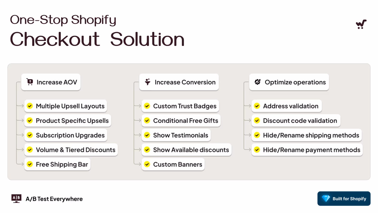
One of CheckoutWiz's standout features is its integrated A/B testing capabilities. You can run experiments on:
The app automatically tracks conversion rates, revenue impact, and statistical significance, making it easy to implement data-driven optimizations.
After analyzing hundreds of high-performing checkout pages and studying conversion optimization data from thousands of Shopify stores, certain patterns emerge. The difference between a 2% conversion rate and a 15% conversion rate isn't luck—it's the systematic implementation of proven conversion principles.
Trust is the bedrock of online transactions. Customers need to feel confident that their personal and payment information is secure before they'll complete a purchase.
Essential Security Elements:
Why This Works: 17% of cart abandonments are due to payment security concerns. Visible security indicators can reduce this anxiety significantly.
Hidden costs are conversion killers. 55% of customers abandon carts when unexpected fees appear at checkout.
Transparency Best Practices:
Page speed directly impacts conversion rates. For every second of delay:
Speed Optimization Essentials:
With mobile commerce accounting for over 50% of ecommerce transactions, mobile optimization isn't optional—it's essential.
Mobile Conversion Factors:
Complex forms are major conversion barriers. 28% of shoppers abandon carts due to complicated checkout processes.
Form Best Practices:
Offering multiple payment options significantly improves conversion rates. Different customers prefer different payment methods based on:
Essential Payment Options:
Shipping flexibility can make or break a sale. Different customers have different urgency levels and price sensitivities.
Effective Shipping Strategies:
Psychological triggers can motivate action, but they must be genuine to maintain trust.
Effective Urgency Tactics:
Warning: False scarcity or urgency can damage brand trust if discovered.
People look to others' behavior when making purchasing decisions. Social proof during checkout can provide the final confidence boost needed to complete a purchase.
Social Proof Elements:
People hate losing something they already have more than they enjoy gaining something new. Smart checkout design leverages this psychological principle.
Loss Aversion Techniques:
Effective checkout design guides customers naturally toward completion without confusion or distraction.
Design Principles:
How information is structured directly impacts completion rates.
Effective Organization:
Technical issues during checkout can instantly destroy conversions and customer trust.
Technical Excellence:
Your checkout must work flawlessly across all devices and browsers your customers use.
Compatibility Essentials:
The best checkout pages are constantly evolving based on real customer behavior data.
Key Metrics to Track:
Systematic testing reveals what actually works for your specific customers.
Testing Opportunities:
The highest-converting checkout pages aren't the result of guesswork—they're the product of understanding customer psychology, implementing technical excellence, and continuously optimizing based on real data. Every element should serve the single purpose of helping customers complete their purchase with confidence and ease.
Your checkout page stands as the final frontier between browsing and buying—the ultimate moment of truth where potential customers either become paying customers or disappear forever. Through our analysis of 15 high-converting checkout examples, we've uncovered the specific strategies, design principles, and optimization tactics that separate high-performing stores from the rest.
The data tells a compelling story: while 69.23% of shoppers abandon their carts on average, the brands featured in this guide have dramatically reduced their abandonment rates through strategic optimization. They understand that checkout isn't just about processing payments—it's about creating confidence, removing friction, and providing an experience that reflects their brand quality.
The most successful checkout pages share these characteristics:


.avif)