.svg)
.svg)
.svg)
.svg)


.svg)
.png)
.png)
.png)
Our Apps Have Driven
5X AOV | 2X Conversions | $30M+ Additional Revenue
5X AOV | 2X Conversions | $30M+ Additional Revenue
.svg)

5.0 (900+ Reviews)


Shopify Apps


.svg)


Mobile commerce has skyrocketed in the past two to three years. And it’s only going to increase from here on. Studies show by 2025, mcommerce will account for 44% of sales.
This makes it extremely important for eCommerce brands to get mobile commerce right.
Just like eCommerce, one of the key elements of mobile commerce is the checkout process. It is critical to optimize your mobile checkout for best results.
In this blog, we list some of the best mobile checkout examples for your inspiration.
While there are various Shopify stores that have optimized their mobile checkout process for ease of shopping and conversions, here are some that used Checkout Wiz for the customizations, and others that inspired us.
PS. Don’t also forget to go through the best desktop checkout page examples here.

R-Malak is one of the best mobile checkout examples. The page simplifies the shopping experience by presenting express checkout payment options prominently, providing clear information on shipping charges, and displaying only essential details. The design ensures a spacious layout, avoids unnecessary clutter, and maintains minimalistic elements to eliminate distractions.

The Shopify mobile checkout page of this horse riding gear brand seamlessly integrates marketing into the purchasing process by introducing new products directly on the page. Moreover customers can see the order summary and apply a gift card during payment.
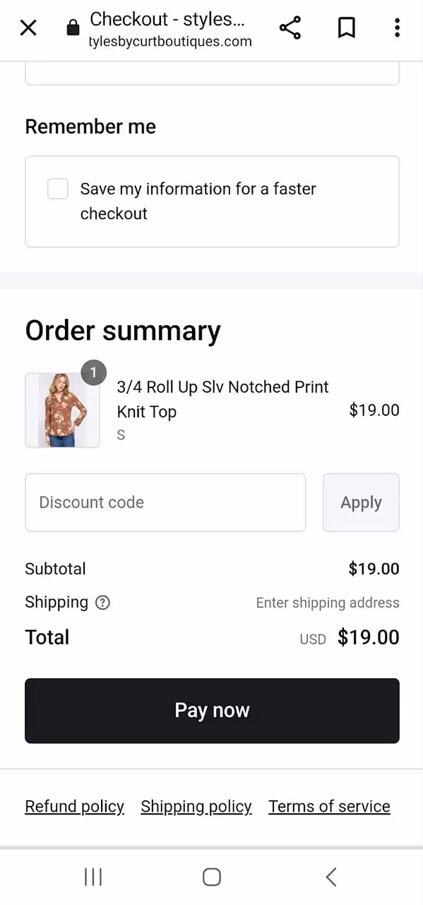
Styles By Curt Boutiques, a women's apparel brand, prioritizes a seamless payment experience for its customers through its Shopify mobile checkout page. The page provides a variety of payment options for customers to select from and allows them to choose their preferred shipping method. With a clean design centered around customer convenience, the checkout page reflects a customer-focused approach.
Check out this guide on 10 Ideas to Upsell and Cross-Sell on Shopify Checkout Page

Another good Shopify mobile checkout example is that of MBA Executive Apparel. It has payment options, streamlined information—shipping address and payment details. Additionally, it incorporates a valuable feature, allowing customers to save their information for a quicker checkout in subsequent transactions.

Explore another mobile checkout page example from Tabs. The checkout page features a dedicated form for customers to share their contact numbers for exclusive offers and updates. Additionally, there's a convenient checkbox to save details for seamless future purchases, simplifying the process for repeat buying.
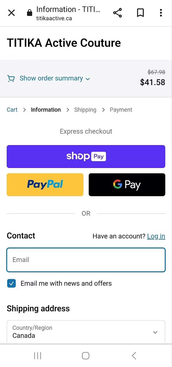
Titika Active Couture incorporates a progress bar on its mobile checkout page, simplifying the experience for shoppers by indicating their proximity to completing the process. Surprisingly, extended checkout procedures stand out as a significant factor contributing to cart abandonment.

Here’s an impressive Shopify mobile checkout page from Homebodii, a brand specializing in women and baby products, including apparel, accessories, and gifts. Despite its simple and minimalist checkout process, the brand has cleverly incorporated a form allowing shoppers to leave notes about their purchases, such as specific instructions. This streamlined approach not only simplifies purchase decisions but also minimizes cart abandonment, ultimately enhancing sales.

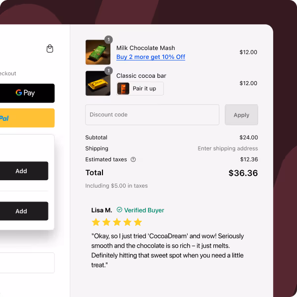
PupSocks has infused its checkout process with engaging elements. Whether it's providing options for express shipping, offering complimentary gifts, or showcasing customer reviews, the brand strategically includes captivating features to direct customers' attention to key areas. These enhancements are seamlessly integrated, ensuring a smooth and frictionless checkout flow.
Recommended read: Shopify gifting on checkout and how to enable it

Here’s another excellent mobile checkout example from A3B's — clean, simple, and efficient. By providing customers with a straightforward method to save shipping and billing addresses, the brand emphasizes a streamlined process and smooth flow, ultimately enhancing sales.

Cure Mushrooms ensures that customers can easily apply discount codes through its Shopify checkout page. The prominently displayed tab for entering discount codes simplifies customers’ final purchase decision, offering a seamless experience.

Another good mobile checkout example is MellowFellow — it chooses a straightforward and minimalist design for its checkout page, requesting only essential information like the delivery address. The absence of non-checkout elements ensures a clean and clutter-free appearance, enhancing the overall mobile checkout experience.

Tumbleweed Plants adopts a straightforward approach to customize its Shopify checkout page, infusing it with the brand's tone. The page prominently features payment options for express checkout at the top, allowing customers seeking a swift transaction to do so without navigating through a lengthy process.

Yamazaki's Shopify checkout page is another good example, incorporating a variety of features to enhance the customer experience. It includes a top progress bar, keeping customers informed about their transaction's completion status. Express checkout options are prominently displayed, and the discount code bar, positioned next to the total amount, showing savings, encouraging customers to proceed with the payment.

Ana Hana Flower's mobile checkout page example is a source of inspiration. Featuring a neat design that separates the address and payment form from the product price section, it provides a clean and organized layout. Additionally, the inclusion of multiple payment options represents a potent conversion strategy that all eCommerce stores could benefit from adopting.

Bureau Unique's Shopify checkout page strategically divides into three sections, each distinguished by a unique background color. This not only enhances its aesthetic appeal but also facilitates a smooth flow. All other elements are concise and contribute to presenting a checkout process that appears straightforward and effortless.

Sunrise Flour Mill's Shopify checkout page goes beyond merely completing a sale. The brand places customers at the forefront by incorporating essential elements to enrich the overall customer experience—such as a top progress bar, wallet payment options, and clear contact and delivery method details. In essence, the page fosters a sense of ease and confidence for the customers.
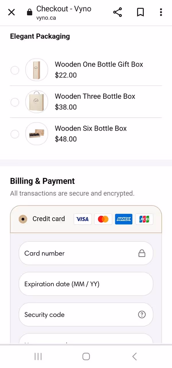
Explore another mobile checkout example - Vyno stands out by providing transparency through the clear display of added taxes and shipping costs. Moreover, it instills confidence and security in customers by featuring a '100% secure payments' badge. Additionally, the page includes product recommendations, a strategic move to potentially boost order values.

PALM., the handcrafted jewelry brand, maintains a simple, minimal, and monochromatic design throughout its pages. On the checkout page, it strategically displays the estimated delivery date and highlights the free shipping offer, effectively guiding shoppers toward finalizing their purchase decisions.

For those looking to enhance brand recall, draw inspiration from Queens Beauty Lounge's Shopify checkout example. The page customization includes a change in color to align with the brand, showcasing how thoughtful design choices can contribute to a cohesive and memorable brand identity.
Recommended read: Complete guide to Shopify checkout customization

Peepers gives the best mobile checkout experience by incorporating a header that aligns with its brand colors. The page seamlessly presents a customer testimonial, cross-sells products, and includes a neatly designed discount code form, all arranged in a cohesive manner.
Learn how trust signals can boost your conversions

In this mobile checkout example by Sensory Toy Box, the toy brand takes a proactive approach by prominently featuring an email and phone number capture form at the top of the page. The form is strategically highlighted in red to draw customers' attention, showcasing the brand's commitment to offering enhanced customer service through the capture of contact details.
Read How can branding improve your checkout page?

Legacy Toys has employed Shopify checkout page customizations to inject vitality into the page with interactive elements. A progress bar at the top informs customers about their proximity to free shipping. Additionally, the page dynamically displays the number of reward points customers would earn upon completing their purchase—simple yet effective elements that add an exciting dimension to the shopping experience.

Honey Bug prioritizes a positive customer experience by incorporating a contact form, urging customers to share their contact details for exclusive information on discounts and promotions. Their mobile checkout page example shows a layout divided into two columns with distinct background colors, enhancing the overall visual appeal.

This mobile checkout example is bustling with elements that prove effective for many brands. From the prominent security badge instilling customer confidence to enticing discounts and the convenient EMI payment option, this checkout page strategically guides customers towards successful conversions.
Also Learn How can you reduce cart abandonment on your Shopify store

Check out this example of Star Kiddo's Shopify checkout page—a clean and straightforward design without any unnecessary distractions. The checkout page prominently shows the discounted amount, ensuring customers are aware of the great deal they're getting. Additional small features, like the ability to add instructions or send the product as a gift, contribute significantly to enhancing the overall quality of the customer experience.

Customizing Shopify checkout pages enables brands to enhance brand recall and elevate the customer experience, providing a more polished and professional appearance—similar to the checkout page of Oasis Art + Play Studio.

To enhance sales, this fitness brand implemented localization strategies by incorporating local payment methods and strategically leveraging customizations on the Shopify checkout page.

Snow, a dental care brand, demonstrates the potential for boosting the average order value through effective cross-selling on its customized Shopify checkout page.

Showerbase, a shower fittings brand, places a strong emphasis on transparency, encouraging customers to carefully review and check a terms and conditions box. This helps cultivate customer confidence and foster loyalty.

The brand's mobile checkout page maintains simplicity while incorporating distinctive features, like inviting customers to share their phone numbers for joining text messaging and receiving exclusive offers. It's a clever strategy for eCommerce brands to expand their SMS lists.

Recognizing the significance of customer registration, Huel aims to encourage it through its Shopify mobile checkout page, highlighting the advantages of creating an account.
Need inspiration from top Shopify checkout examples?
While it's true that customers reaching the checkout stage are highly motivated to make a purchase, surprisingly, over 70% still drop off at this crucial point. Recognize that your mobile checkout page plays a pivotal role, directly influencing your sales. Therefore, it's crucial to optimize it for success.
Additional read: Steps to optimize checkout validation rules on Shopify
That’s where SkaiLama helps. The app offers customization features that not only improve the overall customer experience but also boost your average order value (AOV). With SkaiLama, you can enjoy upselling capabilities, customizable fields and badges, and seamless branding, among other features.
If you're on the lookout for a top-notch Shopify mobile checkout app, explore and install SkaiLama today.
FAQs on 30+ Mobile Checkout Examples


.avif)