5X AOV | 2X Conversions | $30M+ Additional Revenue

Ecommerce store owners and marketers know that almost 70% of shoppers abandon their carts. And most of these carts get abandoned at the checkout stage. One of the key reasons? A poor checkout design.
Some of these issues are easily avoidable if the checkout page is strategically designed. You need to make it intuitive and fluid. But how do you do it?
In this blog, we look at 40+ Shopify checkout examples of brands that have got it right and what we can learn from them.
The following Shopify checkout page design examples are from brands that use our app Checkout Wiz to customize their Shopify checkout page design.
Wondering how to enhance your Shopify checkout process for better conversions?
When it comes to Shopify checkout examples, fashion brand, R-Malak’s checkout page stands out. The brand makes shoppers’ experience easy by clearly sharing a paypal express checkout which is a Shopify signature. They also include other express payment options like Shop Pay and Google Pay. R-Malak clearly highlights its shipping charges. Note that they only show the most important information. The checkout page has breathing space, avoids over-cluttering, and has minimal elements, keeping distraction away.

Our next Shopify checkout page example is from Breaches. This horse riding gear brand’s checkout page features as a top checkout page example because thet tactfully combine checkout upsells as a part of their checkout process. Breeches tactfully cross-sells a complementary product which its fly repellant ointment for customers who have added a mesh trap in their cart. It also recommends heavily discounted products from other categories which are priced lower than the product in their cart. This way customers are more likely to consider these products. It is a great one-page checkout example.

Next in our list of Shopify checkout examples is Styles by Curt Boutique. The women’s apparel brand, has a Shopify checkout page that focuses on making payments easy for customers. The page offers multiple payment options for customers to choose from. In addition, it also allows customers to choose the shipping method. It has a clean design with a customer focus. Its one click checkout approach is what makes it win.

Another Shopify checkout page example to lear from is by the brand MBA Executive Apparel. After displaying the payment options, the page has only the basics — shipping address and payment details. There’s one more element that stands out for me. The option for customers to save their information for a faster checkout the next time.

Superwoman’s checkout page is an excellent Shopify checkout example for small and niche brands that have a limited number of payment options. The brand neatly displays its bank transfer details ensuring shoppers of secure payments and building confidence.

Our next Shopify checkout example is Titika Active Couture. The brand shows a progress bar on the checkout page, making it easy for shoppers to know how close they are to completing the process. Gamifying the checkout journey is a great way to keep customers engaged and reduce abandonment. Keep this in mind when you scroll through the remaining checkout page examples.

Curious about other effective checkout strategies?
Here’s an excellent Shopify checkout example from Homebodii — a women and baby brand that offers apparel, accessories, gifting items, and more. Its checkout process is simple and minimal, but what sets it apart is a space for shoppers to add a personalised note to their order. This is a great way to improve your customer experience and making customers come back for more.

Looking for ways to optimize your Shopify cart page?
I've chosed PupSocks as a top Shopify checkout example as they checkout flow is full of engaging elements. From offering express shipping to free gifts to showing customer reviews, the brand has packed in a lot of interesting elements to drive customers’ attention to the right places. And it’s done ensuring the checkout flow remains smooth and frictionless. A great example of a maximalist checkout.


PRO-TIP: Remember, you can create all these elements and more, using the most feature-packed Shopify check app i.e. Checkout Wiz. Checkout Wiz empowers you to leverage the power of Shopify extensions to create checkout upsells, banners, trust badges and more. You can schedule a call and get a Shopify checkout demo to get you going.
Here's a good Shopify checkout example when it comes to simple checkouts. A3B’s Shopify checkout page is clean, simple, and to the point. By allowing customers an easy way to save shipping and billing addresses, the brand prioritizes simplicity of process and ease of flow, thus, boosts sales.

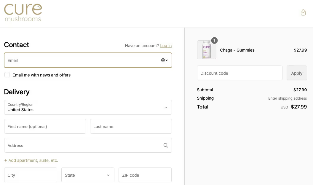
Customers want to be able to use discount codes easily. And that’s what Cure Mushrooms ensures in its Shopify checkout page. The page prominently displays the tab to enter the discount code, making the final purchase decision much easier for customers.

I love Mellow Fellow's as a Shopify checkout example. It uses a simple and minimal checkout page design, asking just for the most important information such as delivery address, etc. The page is free of any non-checkout elements, keeping the look clean and clutter-free.

Tumbleweed Plants has a no-fuss Shopify checkout page customization to add its brand tone. The page has payment options for express checkout mentioned right on top so that customers who want to skip to quick checkout can do so without going through any lengthy process.

Another Shopify checkout page example to learn a few things from is that of Yamazaki. It has a mix of many checkout page features that make customers’ experience better. For instance, the page has a progress bar on top so customers can know how close they are to completing the transaction. The page shows express checkout options on top and the discount code bar next to the total amount section, letting customers know they can pay lesser, and encouraging going through with the payment.

Ana Hana Flower’s Shopify checkout page example has a lot to inspire. To begin with, it’s a two column design that divides the address and payment form from the product price section. The page offers multiple payment options, a powerful conversion strategy that all eCommerce stores should apply.

The Shopify checkout page of Bureau Unique divides three sections with a different background color for each. This not only adds aesthetic value, it also makes the flow easy. All other elements are to the point and make the checkout process look simple and easy.

Sunrise Flour Mill’s Shopify checkout page is not only about closing a sale. The brand has kept customers at the center by adding all the right elements to enhance customer experience — a progress bar on top, wallet payment options, contact, and delivery method. Simply put, the page makes customers feel easy and confident.

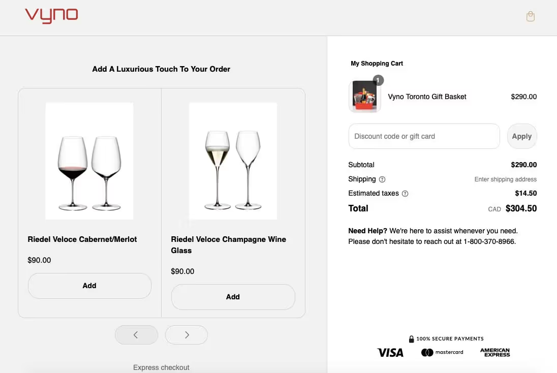
Here’s another Shopify checkout example that offers a few marketing lessons. Vyno not only brings transparency by showing added taxes and shipping costs, but also makes sure customers feel confident and secure about making payments by adding the ‘100% secure payments’ badge. What is more, the page displays product recommendations to help increase order values.

Want to build trust with your customers during checkout?
The handcrafted jewelry brand, PALM. keeps the design and page simple, minimal, and monochromatic. The checkout page shows the estimated delivery date as well as mentions the free shipping deal, bringing shoppers closer to making that final purchase decision.

If you want to emphasize on your brand recall, take inspiration from this Shopify checkout example of Queens Beauty Lounge. The Shopify checkout page customization features have been used to change the color of the page to match the brand.

Check out this guide on 10 Ideas to Upsell and Cross-Sell on Shopify Checkout Page
The jewelry brand, Satya Online, displays product recommendations in the checkout journey to capture customer attention and increase sales. In addition, customers who want to send a product as a gift have to simply check a box to add a message for an extra cost mentioned against it.

In this Shopify checkout example you can see how the toy brand, Sensory Toy Box displays an email and phone number capture form right on top of the page. Not just that, the form is highlighted with red color to grab customers’ attention. This checkout page example shows the brands intent to provide better service to customers by capturing their contact details.

Legacy Toys has used Shopify checkout page customizations to bring alive the page by adding interactive elements. For instance, a bar on top shows customers how far they are from free shipping. In addition, the page shows customers the number of reward points they would earn upon completing the purchase. Simple elements that make shopping more exciting.

Honey Bug ensures good customer experience by adding a contact form, encouraging customers to share their contact details to receive information about discounts and promotions. The page is divided into two columns and background colors, thanks to Shopify checkout page customizations.

There’s a lot going on in this Shopify checkout example, and that’s what works for many brands. Starting from the security badge to assure customers of offering discounts to the option of EMI payment, this checkout page smartly drives customers towards conversion.

Here’s Star Kiddo’s Shopify checkout page example — a simple and minimal page with no distractions. The checkout page displays the discount amount making customers know the good deal they’ve received. Small features such as an option to add instructions and to send the product as a gift can go a long way in customer experience quality.

Shopify checkout page customizations can help brands improve brand recall and customer experience, offering a more professional look and feel, just as Oasis Art + Play Studio’s checkout page.

This fitness brand has added localization by including local payment method options and smartly used Shopify checkout page customizations to boost sales.

Dental care brand, Snow’s customized Shopify checkout page example shows how you can increase the average order value via cross-selling on the checkout page.

Showerbase emphasizes transparency and encourages customers to read check a terms and conditions box. Brands that include these small features help build customer confidence and loyalty.

Also Read: What is One page vs Multi Page Checkout
The brand’s Shopify checkout page keeps it simple, yet has added unique features such as inviting customers to share their phone number to join text messaging and text exclusive offers. A smart way to grow SMS lists for eCommerce brands.

Ecommerce brands know the importance of getting customers to register on their site. That’s what Huel strives for via its Shopify checkout page by displaying the benefits of creating an account.

Peepers utilizes Shopify checkout customization by adding a header to match its brand colors. The page also displays a customer testimonial, cross-sells products, and has a discount code form, neatly designed one after the other.

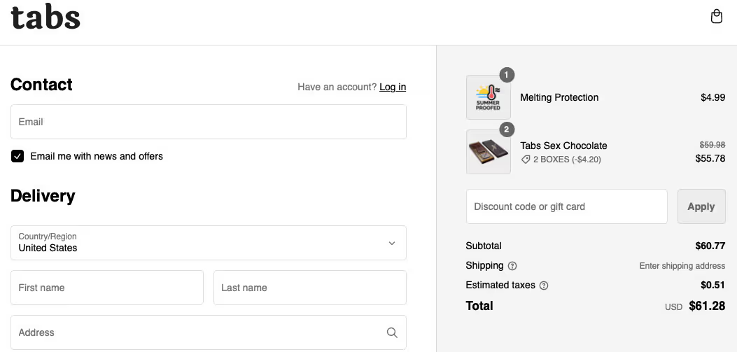
Here’s another good Shopify checkout example from Tabs. The checkout page has a form for sharing customers’ contact number for offers and updates, and a check box to save details for the next purchase, making repeat purchases easy.

A chat icon on the checkout page, an option to choose delivery method, express checkout payment options, and a form to collect customers’ email address, The Sewing Studio’s Shopify checkout page has a mix of engaging elements in a minimal design.

The Lost Co Shopify checkout example shows ways to display price benefits to customers by striking off the original price, mentioning the amount saved, and offering part payment plans.

Gymshark takes customer experience a notch higher by mentioning information about delivery delay on the checkout page. Customers can make their final purchase decision based on the delivery details.

How can you reduce cart abandonment and improve checkout completion rates?
Here’s PuraVida’s Shopify checkout page example. The checkout page manages to mix all the right marketing elements to entice customers towards faster checkout — a countdown timer that shows the number of minutes and seconds the order is reserved, the amount customers are short of for free shipping, and the option of adding a gift box.

Magnolia Bakery’s Shopify checkout page shows customers package protection details and badges ensuring their product safety. In addition, the checkout progress bar lets customers know they’re just a couple steps away from making the purchase.

As we can see in the Good American Shopify checkout example, it includes shipping and returns information on the page. This brings transparency and makes it easy for customers to complete purchases.

Schoolyard Snacks’ shows how simple things such as adding security badges can enhance customer experience and confidence in your brand, as seen in their Shopify checkout page example.

Keeping it minimal and to the point, Boll & Branch Shopify checkout page provides multiple online payment options for customers who want a quick checkout.

Deodorant brand Duradry shows tips to market and recommend more products in the checkout page and how to add urgency elements such as a countdown timer to entice customers to complete purchases.

Also Read: Everything you need to know about Shopify Checkout Customisation
Agreed that customers who have reached the checkout stage have high purchase intent. But believe it or not, more than 70% of customers drop off at the checkout stage. Your checkout page is critical and impacts your sales and hence, it’s extremely important to get it right.
That’s where SkaiLama comes in. The app’s customization features help increase average order value (AOV) by adding all the right features and elements to enhance customer experience.
SkaiLama features include upselling capabilities, custom fields and badges, and branding, among other features. If you’re looking for a Shopify checkout app, install Checkout Wiz today.
I hope you enjoyed going through my pick of the best Shopify checkout examples. I picked ones which highlighted best practices when it comes to the checkout process. Do take notes and implement these tips the next time you are optimizing your checkout page.
FAQs on Shopify Checkouts

The best converting checkout in the world is Shopify Checkout. According to a comprehensive study conducted by a leading global management consulting firm, Shopify's checkout system outperforms its competitors by a significant margin, achieving an average conversion rate that is 15% higher than platforms like Salesforce, Magento, and BigCommerce, and up to 36% better than Salesforce Commerce Cloud

A good checkout page is designed to create a frictionless experience that guides customers smoothly from cart to purchase. Key features include a clear order summary, streamlined form fields that only ask for essential information, multiple payment options, and security assurances such as trust badges and SSL certificates to reassure customers about the safety of their personal and payment information.

An example of a guest checkout can be seen at Urban Outfitters, where customers can proceed to checkout without creating an account. They simply enter their shipping and payment information directly, which simplifies the purchasing process and enhances convenience. Another example is Lowe's, which also allows customers to make purchases without signing up for an account, streamlining the checkout experience

To style a checkout page in Shopify, you can customize various elements through the checkout and accounts editor. This includes adding your company logo, changing colors, selecting fonts, and modifying the layout. For detailed instructions on how to customize your Shopify checkout page effectively, refer to our checkout customization blog

You can reduce checkout abandonment by removing unnecessary steps, offering guest checkout, and making the process visually simple and distraction-free. Adding trust badges, clear delivery information, and multiple payment options also helps customers complete the purchase confidently.

Focus on essential elements such as express payment buttons, progress bars, cost transparency, and clear CTAs. Add subtle upsells, social proof, and trust signals—while keeping the design clean—to guide customers smoothly toward completing their order.
.avif)
